
Showing posts with label inspiration. Show all posts
Showing posts with label inspiration. Show all posts
Friday, January 31, 2014
golden age of insect aviation: the great grasshoppers
Wayne Unten's film may only be 10 seconds long, but it sure packs a punch. Happy Friday, friends!
(Via The Kid Should See This)


Friday, December 6, 2013
Phillip K. Smith III - lucid stead


Lucid Stead is about tapping into the quiet and the pace of change of the desert. When you slow down and align yourself with the desert, the project begins to unfold before you. It reveals that it is about light and shadow, reflected light, projected light, and change.
You can read more about the work at Royale Projects.
(Via Colossal)
Wednesday, November 6, 2013
the new york subway signs experiment
I saw this video last week and it totally made my day.
As Yosef Lerner explains of the project:
(Via A Cup of Jo)
As Yosef Lerner explains of the project:
In New York City, subway conductors have to point at a black and white sign. At every hour of the day. At every stop. On every train. Like they're some sort of automated robot that just happens to go home to families and children and processes complex human emotion. They do this to show that they've fully arrived on the platform.
Conductors spend their whole day in that small booth, alone. It is incredibly loud, and they get minimal human contact. We decided to show our appreciation for their work.
The signs we used:
• You are not wearing pants right now
• You have taken a selfie while driving
• You have seen a passenger naked
• Shoot the target with your laser finger [bullseye]
• You are dead sexy
• You still love Thomas The Tank Engine
• Snape kills Dumbledore
• The 2nd Ave Subway is a lie
• NY is the greatest city in the world
Thank you MTA conductors for getting us there on time (mostly).
(Via A Cup of Jo)
Friday, October 25, 2013
Donna Wilson - 2013/14 collection


Friday, March 22, 2013
like knows like
I came across the Like Knows Like project through their latest short documentary about letterer Jessica Hische, someone whose work, and passion for it, I greatly admire. It wasn't long after checking out their website, however, that I found myself watching each and every one of their videos and wishing for more.
A project by documentary photographer Marije Kuiper and filmmaker Bas Berkhout, Like Knows Like is a showcase both the featured artist, all of whom are talented and inspiring in their own way, as well as the filmmakers themselves, who have done a beautiful job creating each short documentary.
(Via BOOOOOOOM)
A project by documentary photographer Marije Kuiper and filmmaker Bas Berkhout, Like Knows Like is a showcase both the featured artist, all of whom are talented and inspiring in their own way, as well as the filmmakers themselves, who have done a beautiful job creating each short documentary.
The work the artists share on social media inspires us and makes us happy. But the digital world is often criticized as volatile and shallow. Sometimes, we miss the human touch. That’s why the idea was born to make documentaries about the people we admire. With our films and photos, we celebrate the bond between follower and artist. We meet our online loves offline. Through the documentary form, we gain deeper insight into the artist and satisfy our own curiosity.See all of the Like Knows Like films and read more about the project on their website.
(Via BOOOOOOOM)
Monday, March 11, 2013
Patrick Jacobs

Gold Cap Cluster #2, 2011. Styrene, acrylic, cast neoprene, paper, polyurethane foam, hair,
wood, steel, lighting, BK7 glass. 2-inch exposed lens. Interior box
dimensions: approximately 10.6 (wide) x 14.4 (high) x 8.75 (deep) inches.

Fairy Ring with Dandelions, 2010. Styrene, acrylic, neoprene, hair, paper, polyurethene foam, wood, hair, steel, lighting, BK7 glass. 8-inch exposed lens. Interior box dimensions: 48.25 (wide) x 30.25 (high) x 23.25 (deep) inches.

Fairy Ring Mushroom Cluster #5, 2012. Styrene, acrylic, cast neoprene, paper, polyurethane foam, hair,
wood, steel, lighting, BK-7 Glass 2-inch exposed lens. Interior box 10.6
x 14.4 x 8.75 inches.

Raked Leaves (Detail), 2011. Styrene, acrylic, cast neoprene, paper, polyurethane foam, hair,
wood, steel, lighting, BK7 glass. 7.5-inch exposed lens. Interior box
dimensions: approximately 33 (wide) x 28 (high) x 28 (deep) inches.

Fly Agaric Cluster #2, 2011. Styrene, acrylic, cast neoprene, paper, polyurethane foam, hair,
wood, steel, lighting, BL7 glass. 2-inch exposed lens. Interior box
dimensions: approximately 14 (wide) x 10 (high) x 9 (deep) inches.
Jacobs draws inspiration from sources as diverse as historical landscape painting and contemporary chemical companies’ home and garden pest control brochures, such as Chevon’s Ortho Books. Recalling the Claude glass, an optical device popular in the 18th century used to frame the picturesque, the lenses invoke the invisible eye of the wary homeowner searching an otherwise vacant domestic landscape for imagined interlopers. Ortho, Greek for “correct,” further alludes to the unending quest to control any divergence from the norm, as well as the manipulation of our sense of perspective. With such a fusion of influences, these quiet compositions offer a magical view of the mundane. Here, reality has been de-familiarized, and the uncanny has supplanted the commonplace.See more of Jacobs' work at Pierogi Gallery.
Tuesday, January 22, 2013
if I had a million dollars
I would buy...{the inspiration edition: prints}


 Studio on Fire's What We Do Print.
 This Susan Sontag on Art print, from Wendy MacNaughton.


 Gregory Beauchamp's Relativity print.
 This beautiful amazing impossible things letterpress print, from Sycamore Street Press.
 And Lisa Congdon's Roald Dahl print.


Wednesday, December 12, 2012
isaac newton vs. rube goldberg
I don't know about you, but I always enjoy a good Rube Goldberg device, and Isaac Newton vs. Rube Goldberg, created by the Toronto-based creative team 2D House, is a particularly fun, gravity-defying example of the genre. Enjoy!
(Via Colossal)
Wednesday, November 21, 2012
inspiration and giving thanks

Hey, friends. I was inspired by this wonderful piece by Maira Kalman on sfgirlbybay's blog the other day, and was so inspired by the sentiment that I wanted to share it with all of you, too. I'm off to enjoy Thanksgiving in Philadelphia with my family, so other than the scheduled Designer of the Month post on Friday, I'm done with posting this week, but I hope that you all find some inspiration in your lives as well. I'll see you all back here on Monday!
Friday, November 2, 2012
Şakir Gökçebağ

Şakir Gökçebağ with Trans Layers 1, 2010. Wall-installation, 375x650x10cm.
With this week's many disruptions, I'm sorry to say that I've yet to put together a new Designer of the Month series. But as November has 5 Fridays, with any luck, I should just be postponing it a week. And really, this should count as good news, because I'm very happy to be able to share the fantastic work of Şakir Gökçebağ with you all today instead.


Plenum, 2007. Installation, 385x385x8cm.


Toccata & Fugue, 2011. Installation, 605x820x50cm.


Wednesday, October 10, 2012
best made company


Best Made Company is dedicated to equipping customers with quality tools and dependable information that they can use and pass down for generations. We seek to empower people to get outside, use their hands and in doing so embark on a life of fulfilling projects and lasting experiences.I especially love all of the little slogans and virtues featured on their items, such as an ax emblazoned with fortitude and their nature abhors a vacuum shop brush. See more handy, handsome products on the Best Made Company website.
(Via Design Mom)
Monday, September 3, 2012
the pleasure of
The pleasure of from Vitùc on Vimeo.
I thought that this was the perfect thing to share with you all on this unofficial last day of summer. The pleasure of, a short film by Vitùc, captures all of those brief, inconsequential, yet simple and pleasurable little things and moments that make up each of our lives.
(Via Colossal)
Monday, August 27, 2012
green pedestrian crossing


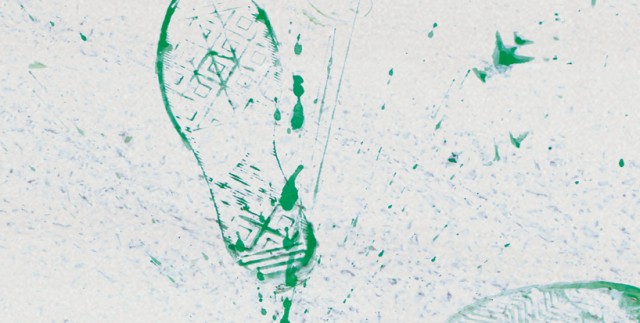

(Via Colossal)
Thursday, July 26, 2012
Julia Pott - belly
Belly from Julia Pott on Vimeo.
Oscar is coming of age, against his better judgment. In doing so he must experience the necessary evil of leaving something behind, but he can still feel it in the pit of his stomach.I wasn't planning on posting an additional animation while I was doing my super short animated film fest! posts, but Julia Pott has created such a weird, wonderful, imaginative, and moving animated short film with Belly that I really would be remiss not to share it. I hope you all enjoy it as much as I do.
(Via BOOOOOOOM)
Wednesday, July 25, 2012
i-beam chelsea loft


(Via Design Milk and New York Magazine)
Tuesday, July 24, 2012
wevther


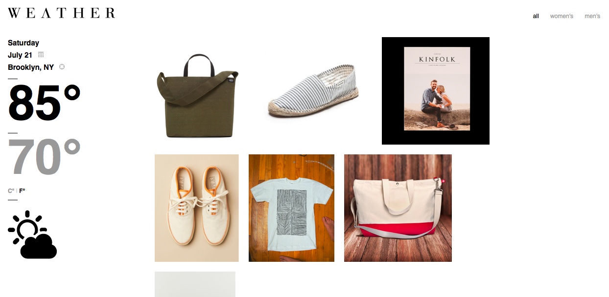
(Via swissmiss)
Thursday, June 21, 2012
Amelia Fais Harnas - wine stains

Self-portrait as Saint Pompette, No. 2, detail | 2012 | Damiani Vino Rosso, bronze powder, acrylic on cotton | 29" x 22.5".

Duke (Bacchus) | 2012 | Damiani Vino Rosso, bronze powder, acrylic, polyester thread on cotton | 45” x 32”.

The Three Graces | 2012 | Damiani Vino Rosso, bronze powder, acrylic, metallic thread, polyester thread on cotton | 5’ x 3’.

The Winemaker, No. 3 | 2012| Damiani Vino Rosso on cotton | 32” x 30”.

The Consultant | 2012 | Damiani Rougeon on cotton | 28.5” x 20”.
Combining wine, embroidery, acrylic, and bronze powder on a cotton canvas, Amelia Fais Harnas' Wine Stains portraits are remarkable both for their beauty and technique. Because I don't know about you, but this is the first use of wine as ink that I've ever seen, and I can't imagine that anyone could possibly do it better. As Harnas explains of these works:
(Via Colossal)
I create portraits by staining fabric with red wine using a wax resist (much like batiks) to build a light/dark pattern. I may decide to add embroidery (split stitch, to be precise) or machine sewing to reinforce the design or composition. The end result is a blend of chaos and control.
A portrait artist at heart, I am particularly intrigued by the challenge of trying to control the unpredictable nature of wine bleeding through fabric in order to channel the equally imprecise nature of a person’s character. In addition, the sacred aspect of wine lends itself to religious iconography, reminding many of the Shroud of Turin: one who drinks wine may come to feel a certain level of saintliness sipping on this liquid form of divinity. So, this is a form of consecration.
(Via Colossal)
Subscribe to:
Posts (Atom)